
Website Case Study
BANG Edutainment Website
A refreshed website for a Brent-based organisation delivering leadership, wellbeing, mentoring, creative, and community programmes.
Project Overview
BANG Edutainment needed a refreshed website that clearly communicates who they are, what they do, and how young people, partners, and community stakeholders can engage with their work.
The site was designed as a warm, energetic, youth-focused digital presence for a Brent-based organisation delivering leadership, wellbeing, mentoring, creative, and community programmes.
The final website presents BANG as confident, active, and community-rooted, with strong visual storytelling, clear project pathways, and accessible routes into contact, media, and programme information.
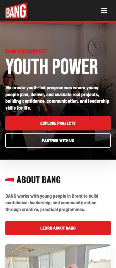
Website Screens
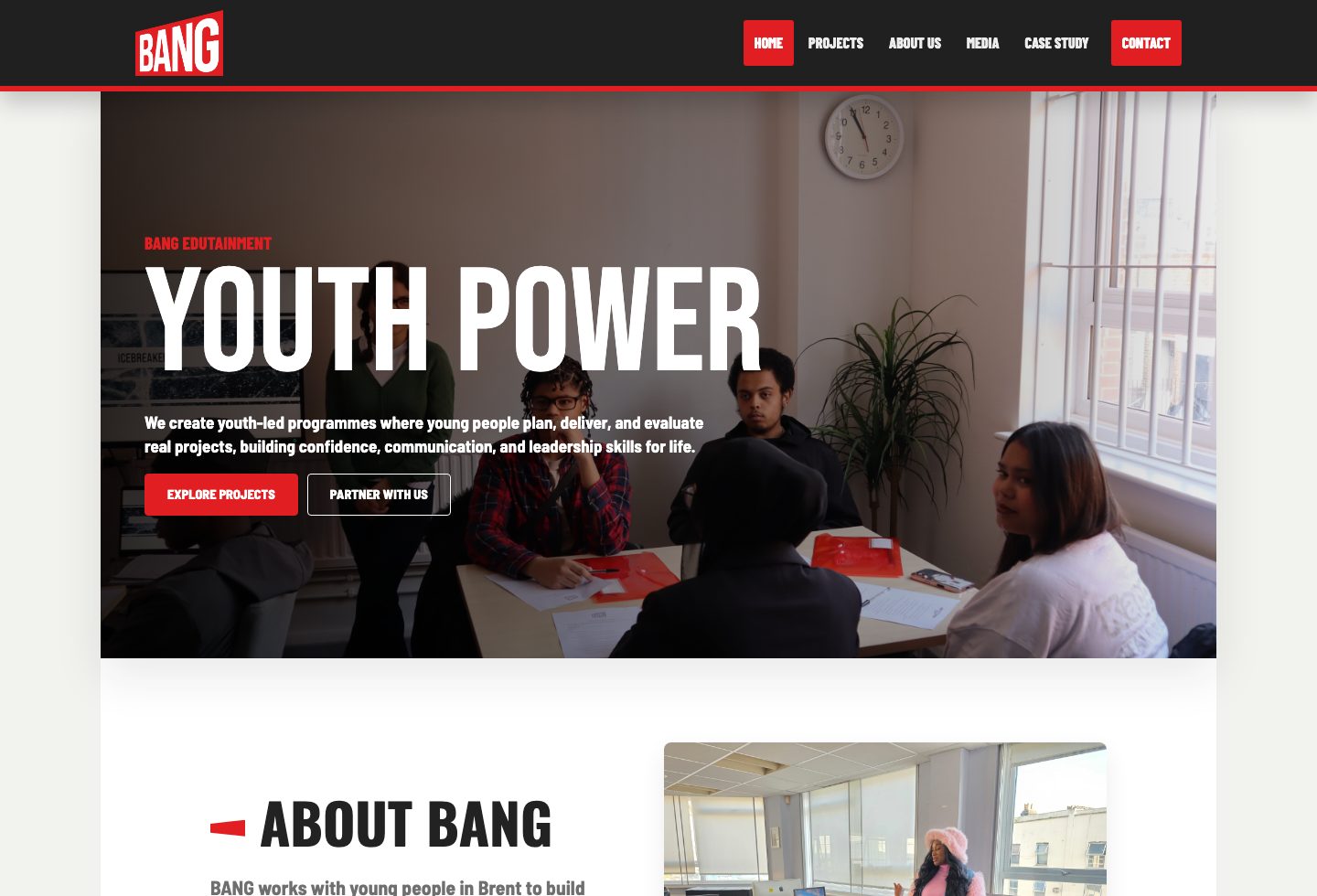
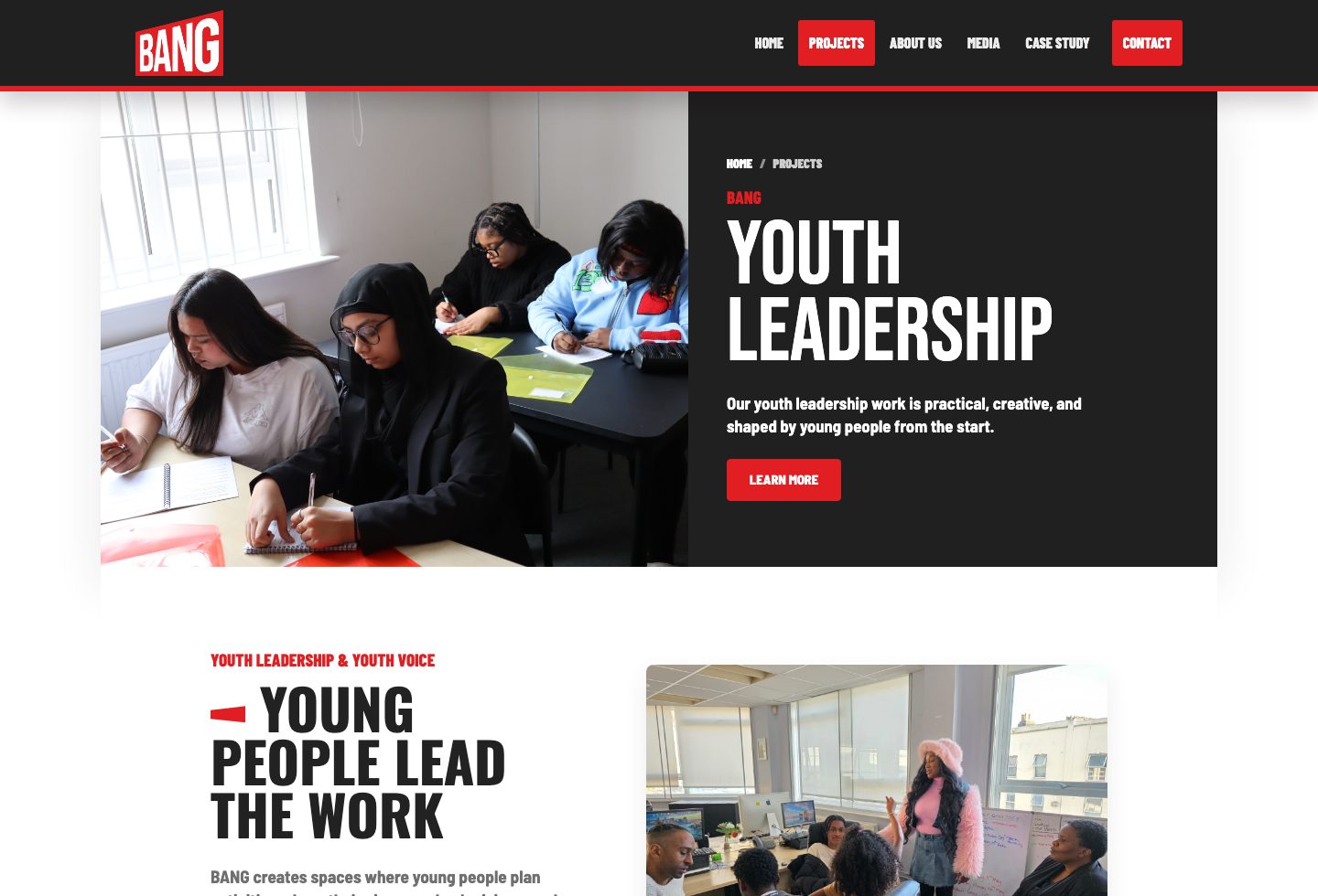
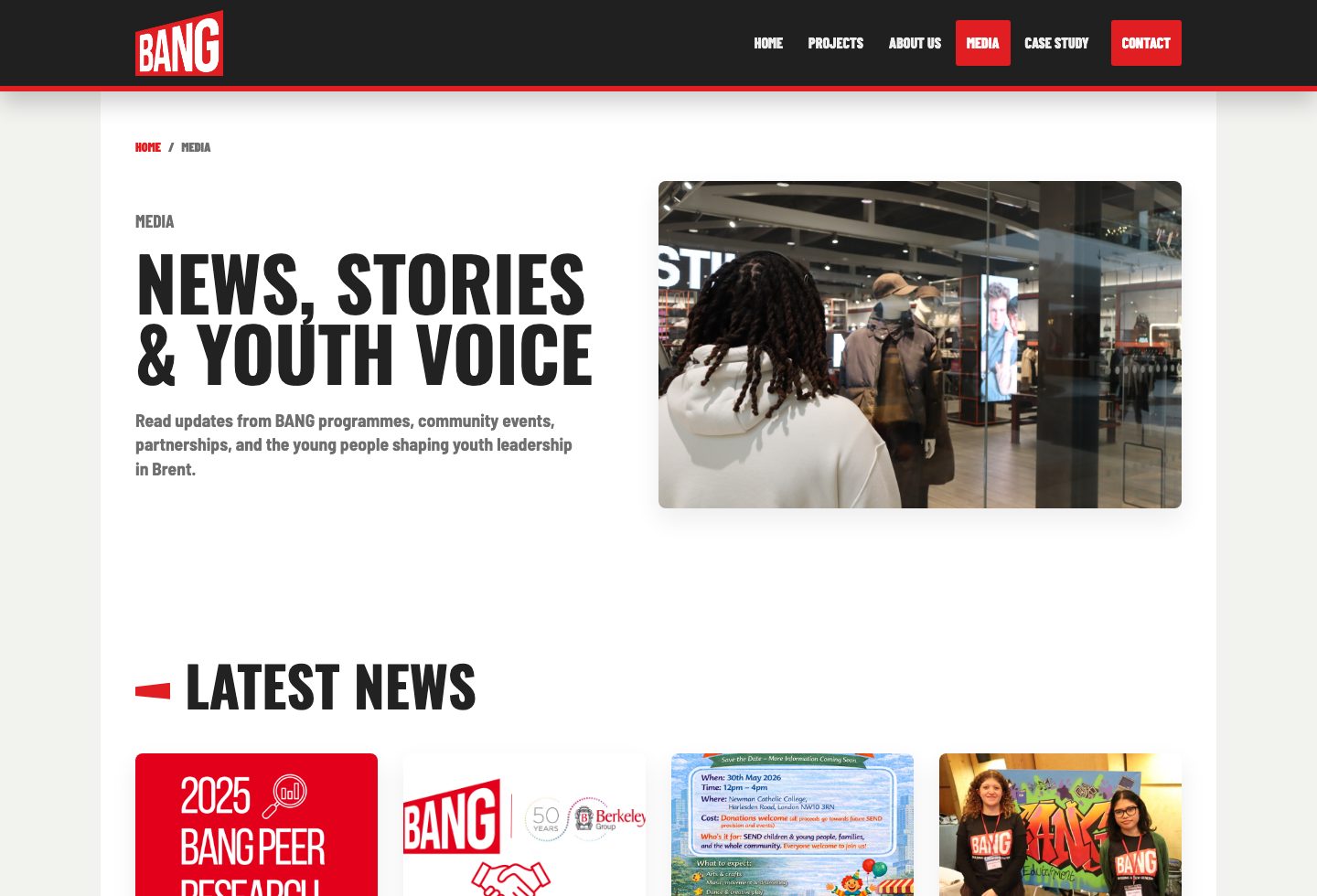
Screenshots from the finished website show the homepage, project journey, media page, and mobile layout.
The Challenge
The website needed to do several things at once:
- Explain BANG's mission quickly to new visitors.
- Showcase youth leadership and project work without overwhelming users.
- Make the organisation feel credible to funders, schools, partners, families, and young people.
- Use photography and bold design to reflect real community energy.
- Keep navigation simple across home, projects, about, media, and contact pages.
The main design challenge was balancing professionalism with youth-led energy. The site needed to feel trusted and established, but not flat or corporate.
Strategy
The structure was built around a simple user journey:
- Understand BANG's purpose.
- Explore the projects.
- Learn about the organisation.
- See stories, news, and real moments from the work.
- Contact BANG or start a partnership conversation.
The visual direction uses a strong red, black, white, and soft neutral palette. Large uppercase headings, image-led sections, red accent shapes, and bold call-to-action buttons create a clear identity while keeping the page layouts easy to scan.
Design Direction
The website uses:
- Large hero imagery to make young people and community activity visible immediately.
- Bold typography to create confidence and momentum.
- Reusable card grids for news, projects, partners, and related content.
- Consistent header, footer, breadcrumb, and button patterns across pages.
- Section spacing and responsive grids to keep pages readable on desktop and mobile.
Use Of Images
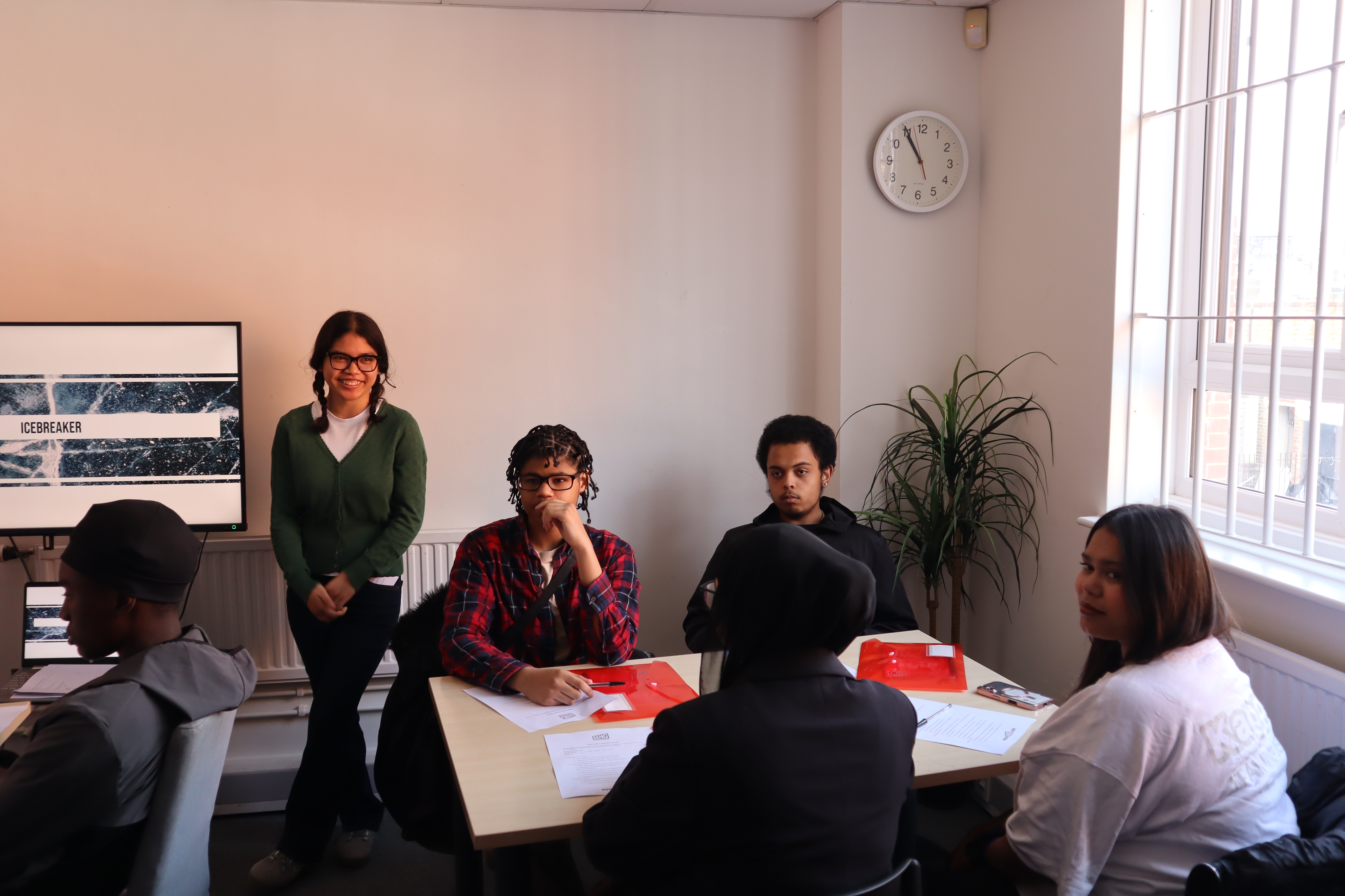
Rather than using decorative graphics, the site relies on real images from BANG's work. This helps the organisation feel authentic and grounded in lived activity.
Key Pages
Home
The homepage introduces BANG through a strong "Youth Power" hero, then guides visitors into about content, latest news, core projects, partners, and testimonials.
Projects
The projects page focuses on youth leadership while also surfacing related areas such as creative therapy, STACKS, mentoring, research, and SEND support.
Programme Detail
The programme detail page gives visitors a focused view of Youth Leadership & Youth Voice, including the target age group, programme purpose, outcomes, and related projects.
About
The about page explains BANG's mission, values, and wider brand ecosystem. It helps partners and funders understand the organisation's purpose and approach.
Media
The media page collects news, stories, visual moments, and updates from the organisation's work, helping the site feel current and active.
Contact
The contact page keeps the conversion route simple, with contact details, a short enquiry form, and clear language around partnerships and programme enquiries.
User Experience
The navigation is intentionally compact: Home, Projects, About Us, Media, and Contact. This keeps the site understandable for different audiences without requiring deep menu structures.
Calls to action are placed where users naturally need them, including project exploration, programme enquiries, partnership prompts, and contact routes.
The site is responsive, with grids collapsing into single-column layouts on smaller screens. This keeps imagery, text, and buttons readable on mobile.
Accessibility And Usability
Accessibility considerations include:
- Semantic HTML structure.
- Skip link support.
- Descriptive image alt text.
- Keyboard-focus styles.
- Mobile navigation with
aria-expandedstates. - Clear contrast between primary actions and page backgrounds.
- Responsive layouts that avoid text overlap.
Technical Implementation
The website is built as a static HTML, CSS, and JavaScript site. This keeps the project lightweight, easy to host, and simple to maintain.
Core implementation details:
- Shared stylesheet in
styles.css. - Shared interaction script in
script.js. - Mobile navigation toggle.
- Testimonial slider with reduced-motion consideration.
- Reusable layout classes for panels, grids, cards, buttons, and content widths.
Potential Next Steps
- Add individual news article pages.
- Add dedicated pages for each project area.
- Add downloadable reports or impact PDFs.
- Add analytics to understand user journeys.
- Replace the mailto contact form with a hosted form handler.
- Add a content management workflow if the team needs to update news regularly.


Outcome
A Clearer, More Confident Online Presence
The finished website gives BANG a clearer and more confident online presence. It communicates the organisation's youth-led mission, makes project work easier to understand, and gives partners, families, young people, and stakeholders obvious next steps.
The result is a site that feels active, credible, and rooted in the people BANG works with.
View The Website